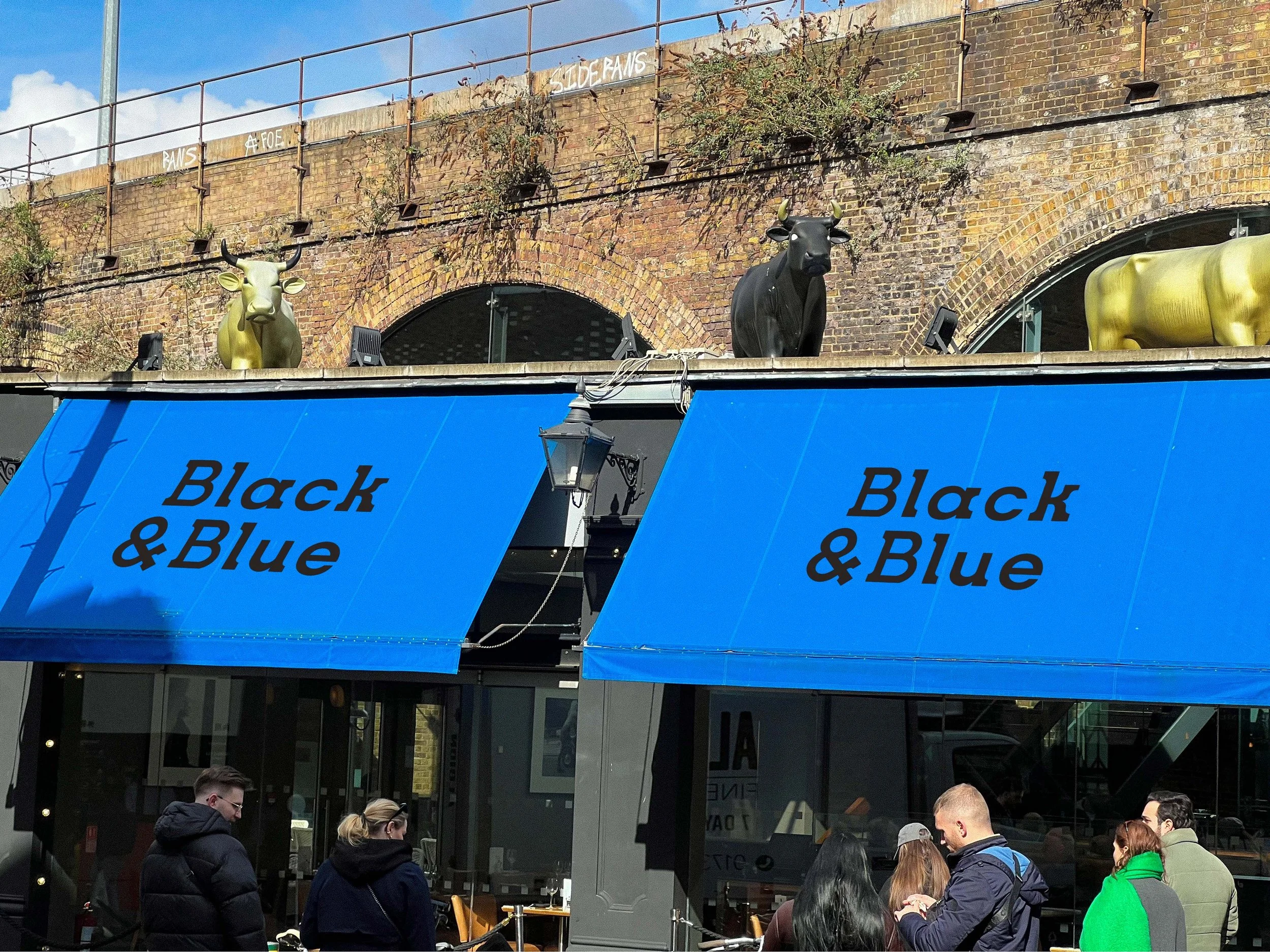
Black & Blue Steakhouse
Typeface Design
The Brief:
Create a bespoke typeface to solve a typographic problem.
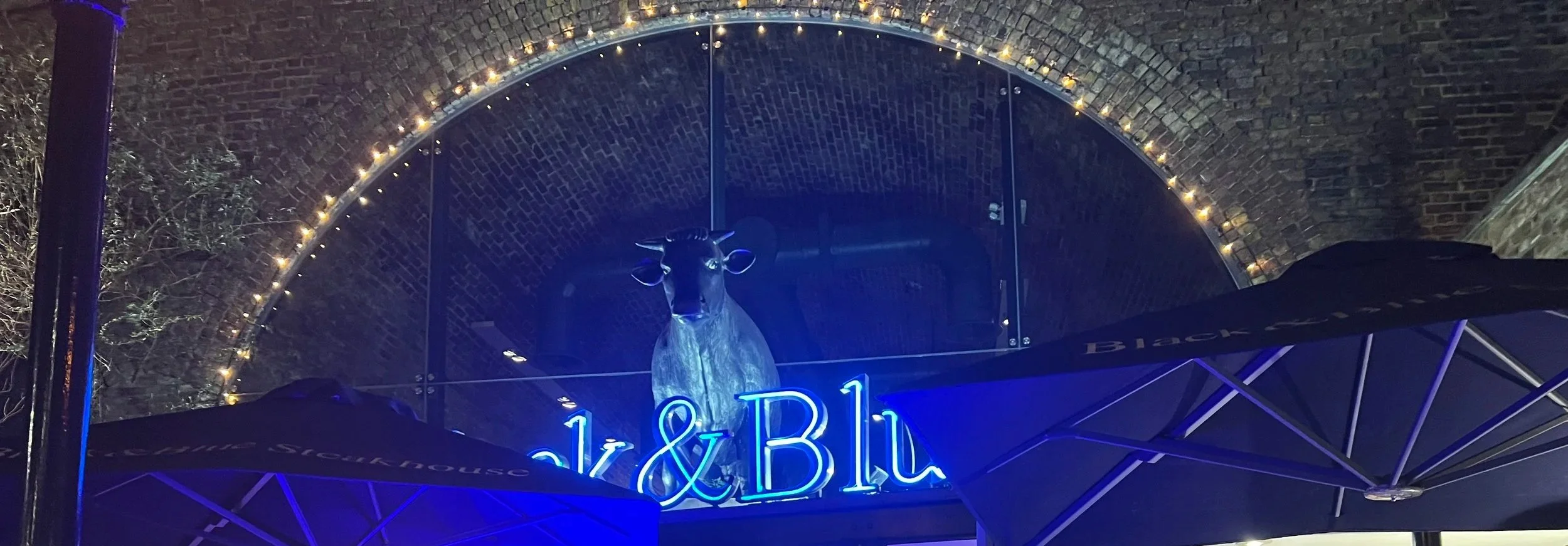
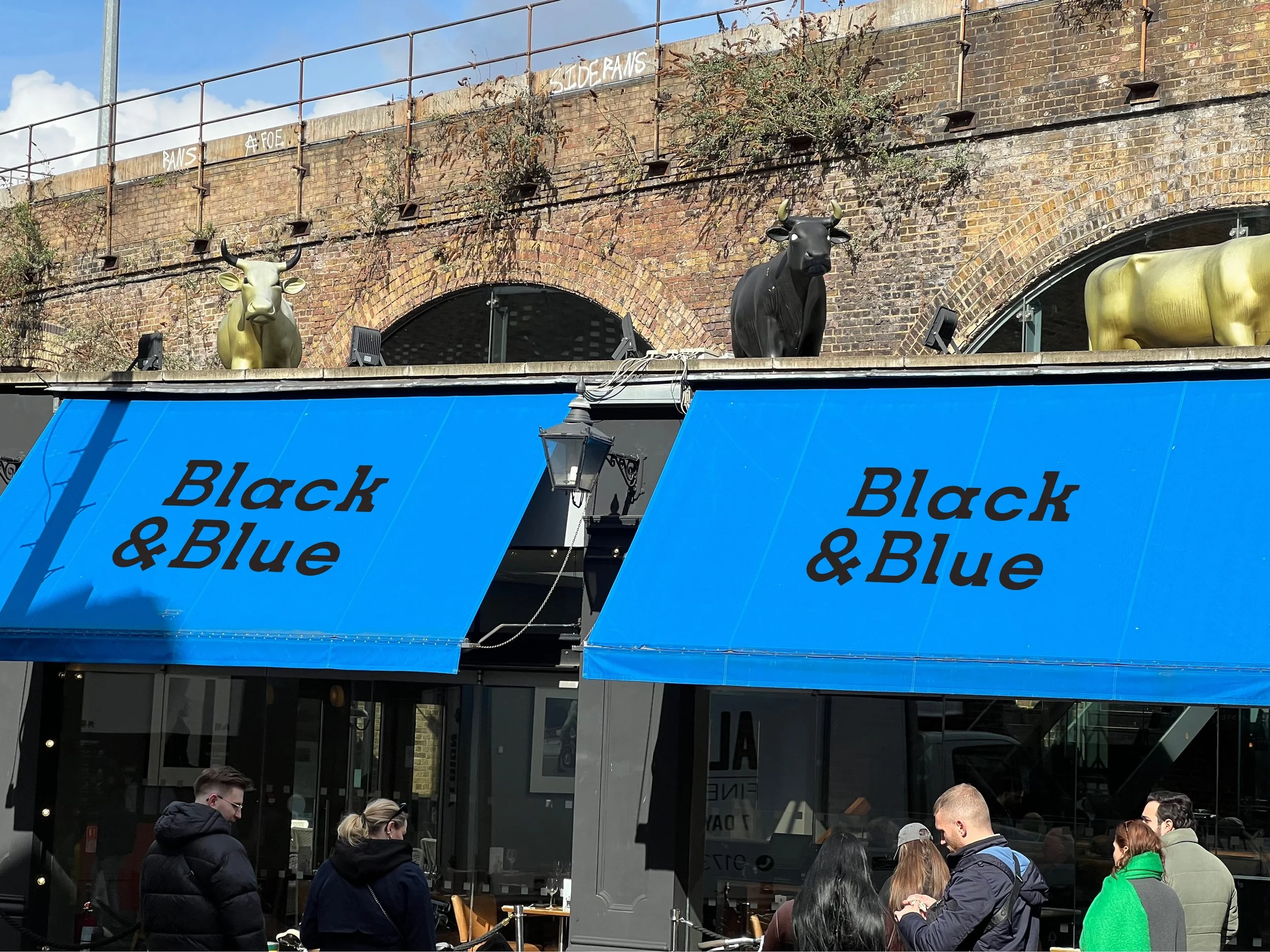
The typographic problem with Black & Blue is that the choice of Times New Roman for this restaurant logotype feels unintentional. Times doesn’t match the feel of the restaurant. Times has a classy and elegant feel. This aspect is effective for Black & Blue because the restaurant is somewhat formal. The problem is that Times feels a bit too formal and elegant in this case.
Solution:
The Problem:
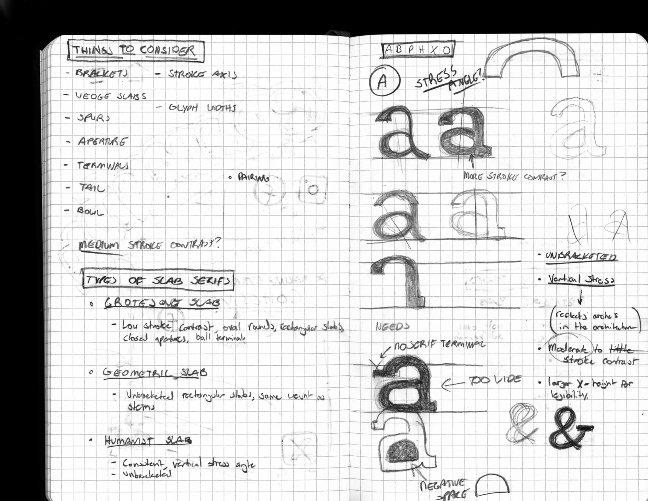
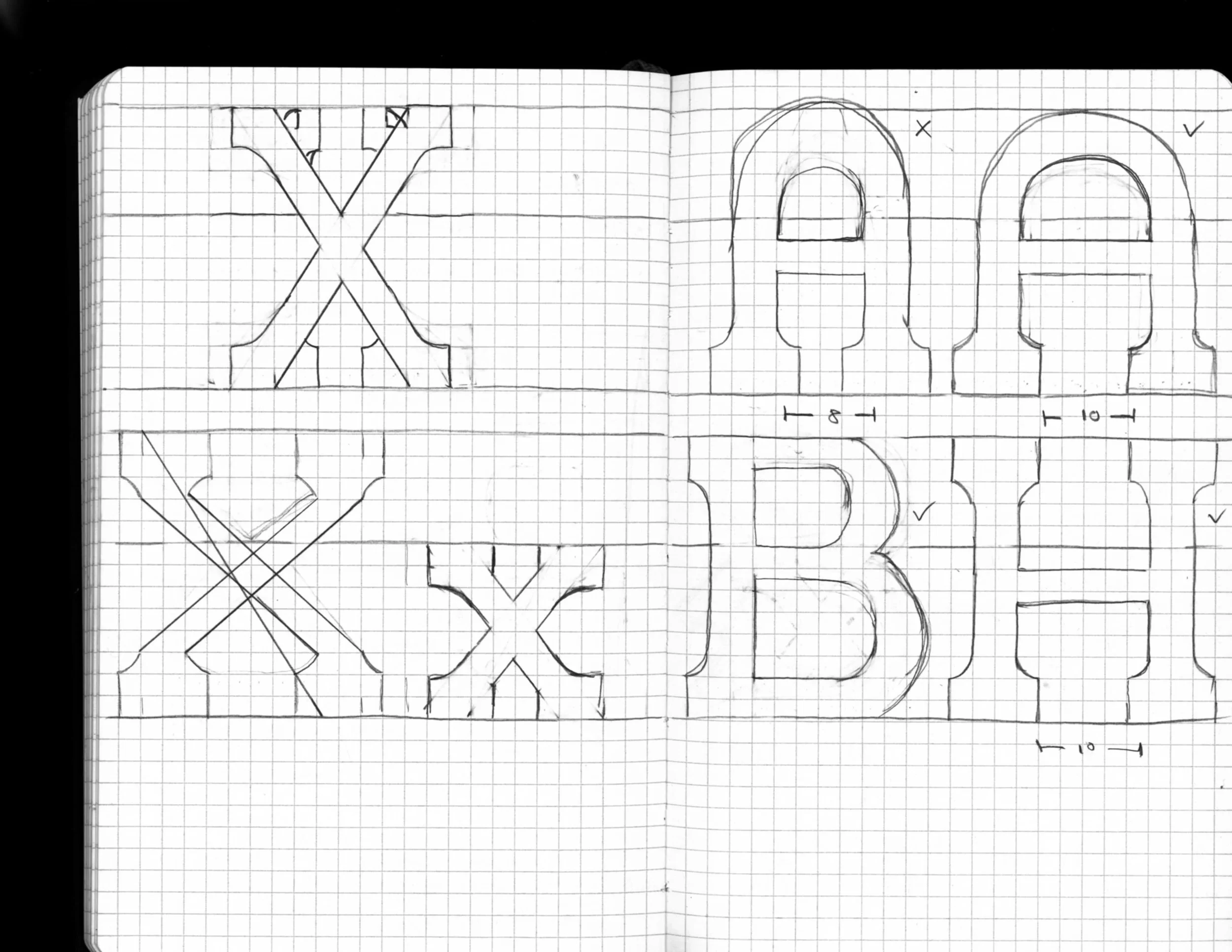
Strategy:
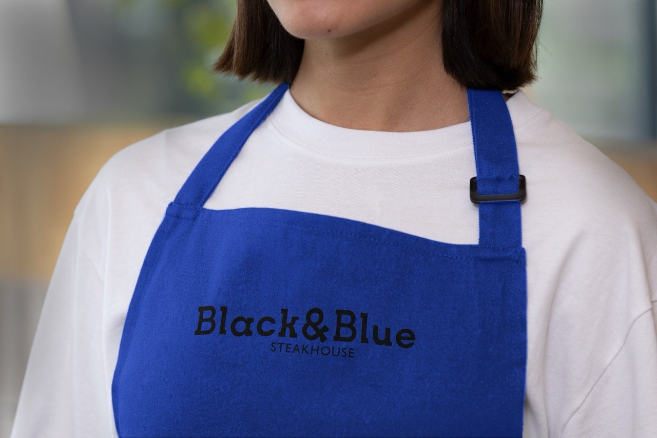
Taking the architecture into consideration, I implemented the brick and the arches into the glyphs with the slab serifs as well as the curved edges.
Taking the architecture into consideration, I implemented the brick and the arches into the glyphs with the slab serifs as well as the curved edges.
What stood out to me the most when visiting the restaurant was the architecture of the building. The restaurant has exposed brick arches that run throughout the entirety of the restaurant, giving the space a very industrial feel.